最も簡単なフリーフォームレスポンシブアプリビルダーで作成
レスポンシブな構築に革命を起こし、フレックスボックスを使わずにドラッグ&ドロップできるようにしました
最も柔軟なビルダー
目に見えるものは、得られるもの
コンポーネントを画面上の必要な場所に正確に配置し、フレックスボックスは使用しません。
すべての画面サイズに対応するカスタム設計
公開時にアプリがどのように表示されるかを推測する必要はありません。デザインをピクセル単位までプレビューします。
段組レイアウトの作成
デスクトップやタブレット向けの段組レイアウトを、これまでにない方法でデザインできるようになりました。
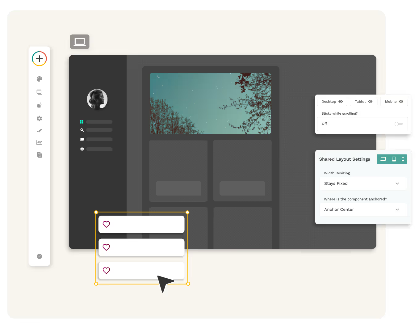
フリーフォームレスポンシブビルダー
Adalo 2.0 Builder内では、各ブレークポイントを完全にカスタマイズして、目の前で各デバイスタイプでどのように表示されるかを正確に視覚化します。
- 他のビルダーのようにフレックスボックスやグリッドシステムに縛られることはありません。これは真にフリーフォームであり、必要に応じてコンポーネントを再配置して、思い描いたものを正確に作成できます。柔軟性を活かして、好きなように設計できます。
- Adaloは、すべてのプラットフォームで利用できるアプリを構築する最も簡単な方法です。
レスポンシブエンドアプリ
レスポンシブデザイン機能により、モバイル、タブレット、デスクトップで最高のエクスペリエンスを実現する美しいアプリで顧客を喜ばせることができます。
- アプリが各画面サイズでどのように表示されるかを推測する必要はもうありません
- 公開する場所に妥協する必要はもうありません
- 支離滅裂な体験に甘んじる必要はもうありません

Adaloは、ネイティブとウェブの両方でアプリを構築するための最良の方法です
Health & Wellness
News & Weather Apps

Food & Beverage
Finance & Crypto Apps


Education
Entertainment & Game Apps

Professional Services
Photography Apps


ヘルプドキュメントをご覧ください!
まだヘルプが必要ですか?専門家に依頼
Adaloのエキスパートは、お客様のアプリを次のレベルに引き上げるお手伝いをします。
その他のリソースをお探しですか?
よくあるご質問
レスポンシブデザインは、優れたユーザーエクスペリエンスを提供したいアプリにとって不可欠です。非常に多くの異なるデバイスと画面サイズが利用可能であるため、どこにアクセスしてもアプリの外観と機能が最適であることを確認することが重要です。レスポンシブデザインにより、使用するデバイスに関係なく、すべてのユーザーに一貫性のある楽しいエクスペリエンスを提供できます。
アプリがデスクトップ、タブレット、モバイル デバイスのいずれで使用されている場合でも、レスポンシブ デザインにより、意図したとおりの外観と機能が保証されます。これにより、画面サイズごとに複数のバージョンのアプリを作成する必要がなくなり、時間とコストを大幅に節約できます。
Adaloのレスポンシブビルダーは、真にフリーフォームになるように設計されており、コンポーネントをドラッグ&ドロップして好きなように配置することができます。グリッドシステムやフレックスボックスを使用してデザインの選択肢を制限する他のビルダーとは異なり、Adaloは正確なビジョンに合ったデザインを作成する柔軟性を提供します。
Adaloのレスポンシブビルダーでは、各ブレークポイントを完全にカスタマイズして、各デバイスタイプでアプリがどのように表示されるかを正確に視覚化できます。つまり、アプリを公開する前に、モバイルデバイス、タブレット、またはデスクトップでアプリがどのように表示されるかを正確に確認できます。また、Adaloは、すべてのプラットフォームで利用できるアプリを構築できる唯一のビルダーであり、マルチプラットフォームアプリを構築する最も簡単な方法です。